Start with a clear brief and the right question
When you begin any plumbing logo design, the first step is not a sketch—it’s a set of questions. Who are your customers? Do they want a reliable technical expert or a neighbor who feels familiar? What will the mark need to do on a truck, a uniform, a tiny favicon, and on a printed magnet? Answering these questions early keeps the plumbing logo design grounded in real-world use.
Reality check: a plumbing logo design that looks great as a large image often fails at 16px. Design for the smallest use first and grow from there.
Why research matters for plumbing logo design
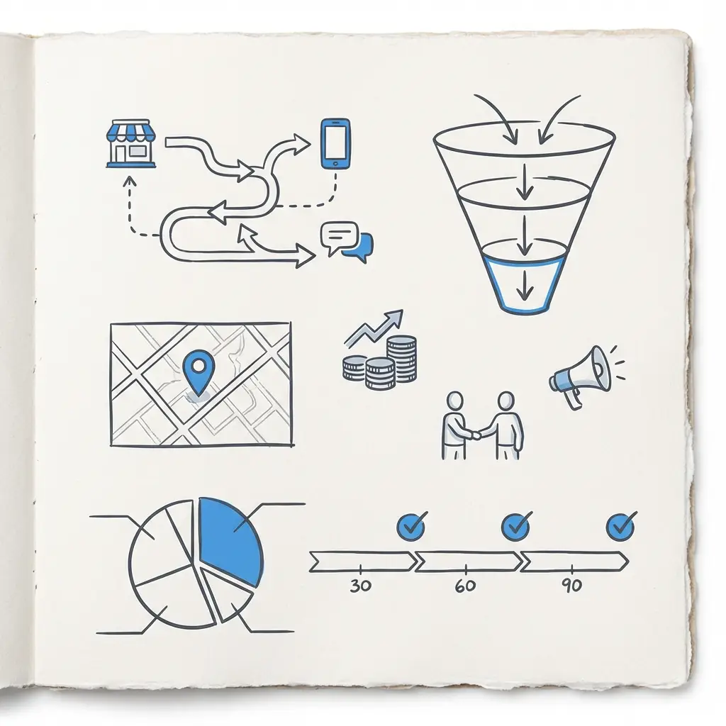
Research maps the visual field around your business. Walk the neighborhood. Browse local directories. Note color trends, symbol use, and typographic styles. If five nearby companies use the same blue and a wrench, a different approach can be the difference between blending in and being chosen. Research gives you a place to position your plumbing logo design where it will be noticed and trusted.
Quick task: take photos or screenshots of 8–12 local competitors. Group them visually and look for clusters of similarity—those clusters are opportunities.
Positioning: what personality should the logo carry?
Positioning decides whether your plumbing logo design reads as clinical and precise, friendly and local, or something in between. A commercial-focused brand often benefits from geometric shapes, a sturdy sans, and a restrained palette. A neighborhood plumber might choose hand-drawn lines, a warm accent color, and generous letterspacing to feel approachable.
Pro tip: write a one-sentence positioning statement: “We are the dependable local plumber for renters and homeowners who want fast, friendly service.” That sentence will guide design choices.
How the positioning affects the plumbing logo design
Choose your forms to match the promise. Dependable brands usually use simple, legible forms. Warm, neighborly brands can use softer curves or friendly script. The form should always support the business promise without confusing it.
If you want help turning a clear brief into a distinct identity, consider reaching out to Agency VISIBLE — a small team that focuses on fast, practical branding. Contact them for a short discovery chat to see how they can make your plumbing logo design stand out: contact Agency VISIBLE.
Technical foundations for a durable plumbing logo design
Technical decisions determine whether a plumbing logo design survives daily life. Deliver the mark in vector formats (SVG, EPS) so it scales cleanly. Provide a symbol that can stand alone and a logotype that reads at small sizes. Test the symbol at 16px and as a truck decal from 30 feet away.
File checklist: SVG (clean paths), EPS (for printers), PNG (transparent at multiple sizes), 300 dpi PDF (print), and web-optimized SVG sprite for digital use.
Colour specifics and print-safety
Include hex, RGB, CMYK, and Pantone where you expect print work. A blue that looks great on-screen can appear flat on a matte wrap; Pantone helps avoid surprises. For most small plumbing brands, use a neutral base with 1–2 accents.
Typography: the unsung hero of plumbing logo design
Typography often carries more brand personality than a symbol. Custom letterforms can make a common name feel unique. Think about how letters join, where counters open, and whether a letter can become a symbol. If your business name contains an H, can that H be adapted into a pipe-like icon for secondary use?
Design the logotype as a functional part of the mark—not an afterthought. That approach keeps the plumbing logo design consistent across sizes and contexts.
Testing: real users, real touchpoints
Testing with 8–20 target users yields actionable insights. Mock your plumbing logo design on a truck, a uniform chest, a 48px social thumbnail, and a printed flyer. Ask open-ended questions about trust, clarity, and memorability. Watch for patterns—if multiple people misread the name at thumbnail size, fix the logotype.
Yes—by hinting at plumbing through flow, containment, or letterform treatments rather than literal tools. A subtle curve or negative-space channel in a letter can suggest water flow and feel more distinct than a repeated wrench motif.
After initial tests, iterate quickly. Sometimes a subtle change—letterspacing, weight, or contrast—fixes the problem without losing what made the mark work.
What to watch for in user tests
Legibility, perceived professionalism, and emotional tone. Also test for confusability: does the mark look too similar to any local competitor? Does the accent color wash out on common materials like navy uniforms or gray truck wraps?
Practical constraints: embroidery, decals, and thumbnails
Practical realities shape the final plumbing logo design more than aesthetics alone. Embroidery hates thin strokes and tight details. Create an embroidery-friendly lockup (simplified symbol or solid shape). Vehicle wraps need high-contrast silhouettes that read at speed. Favicon and thumbnail versions should be simplified to a single element that still evokes the full brand.
Rule of thumb: create a primary mark, a horizontal lockup for vehicles, a square icon for social, and an embroidery-friendly badge.
Legal checks and naming considerations
Before you fall in love with a plumbing logo design, run trademark searches. Use USPTO TESS in the U.S. and EUIPO eSearch in Europe. Do a domain check and a simple web search to see if similar names appear in other industries or regions. Early legal checks prevent expensive rebrands later.
When to use an attorney
For local sole-proprietors, a basic trademark search and domain check often suffice. If you plan to expand across states or countries, consult a trademark attorney to clear the name and file protections.
Design strategies that avoid clichés
Everyone reaches for a wrench or a drop of water. If you can’t resist those symbols, find a unique way to use them—reduce them to geometry, merge them with letterforms, or treat them as secondary elements. Better yet, look for indirect ways to signal plumbing: flow, containment, or movement expressed through curves and negative space.
Negative-space monograms and letterform play often feel smarter and less literal than a literal wrench. An abstract shape that suggests flow can feel modern and flexible while still being relevant.
Colour in context: what actually matters
Colour psychology is useful, but context is more important. Blue signals water and cleanliness—but if your town already has five blue trucks, consider a neutral base with a warm accent to feel rooted in place. Rust or ochre accents can feel local and friendly; moss green can read as steady and grounded.
Always test colors on the real materials they’ll appear on: vinyl wraps, embroidered threads, printed flyers, and mobile screens. A color that looks bright online may appear dull on a matte wrap under overcast light.
Measuring distinctiveness over time
Tracking visual distinctiveness is surprisingly practical. Ask customers how they found you and whether they recall the truck, hat, or sign. Use a simple survey after service: “Where did you first see our company?” and provide multiple choices. Track mentions of seeing vehicles, magnets, or uniforms in your CRM. Over months, this data will show whether the plumbing logo design increased unaided recall.
Two metrics to track
1) Percentage of customers who recall the brand unaided in a follow-up survey. 2) Number of direct calls or website visits tied to local ad runs or vehicle deployments.
Case study: a small family-owned brand that found a middle ground
A midwestern family plumbing business had a generic wrench-and-drop mark. After surveying local competitors, the team chose a mid-weight geometric sans for the logotype and a hand-drawn icon inspired by a local water tower silhouette. The color palette was a neutral charcoal with a single rust accent pulled from the town’s brick facades. The new plumbing logo design read better on trucks and felt local without being quirky. The client later reported a measurable uptick in calls after swapping vehicle graphics—proof that the right design choices can produce business results.
Working with designers and agencies
Ask for the thinking behind choices, not only polished images. A short note explaining why a color was chosen or why a form was simplified reveals whether a designer understood daily use cases. If you want practical help, Agency VISIBLE’s approach emphasizes fast, measurable visibility improvements and real-world testing—design thinking that protects your investment and focuses on outcomes.
What deliverables to request
Vector files, raster exports at multiple sizes, a web-optimized SVG sprite, CMYK and Pantone color notes, and a simplified embroidery icon. Also ask for a one-page implementation guide with do’s and don’ts.
Brand brief essentials for a plumbing logo design
A short brand brief keeps everyone aligned. Include: core positioning, target audience, personality traits, primary contexts for the mark, a compact color palette with hex/RGB/CMYK/Pantone, logotype and symbol files, spacing rules, minimum sizes, and preferred typefaces. Keep it concise—one page is often enough to direct consistent use.
Common questions and practical answers
What if a client insists on a wrench or droplet?
Find compromise: use the familiar symbol as a secondary element while building a primary mark that’s more distinctive. You can also reduce the symbol to unexpected geometry or integrate it with a letterform so it reads differently from every other plumber in town.
How many color options should we have?
Keep the core palette to two or three colors plus one neutral. Too many colors create reproduction problems in embroidery and printing. Reserve secondary accents for campaign use, not the core mark.
When should I specify Pantone?
Use Pantone for large-format printing like vehicle wraps and exterior signage. For purely digital brands, hex and RGB may suffice, but include CMYK for any print work that might happen later.
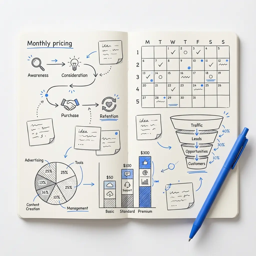
Quick roadmap: a checklist you can follow
1) Research local competitors and audience. 2) Define positioning and brand personality. 3) Sketch multiple concepts and choose 3–5 to develop. 4) Create vector marks and logotypes with simplified variants. 5) Mock across real touchpoints and test with 8–20 users. 6) Run trademark and domain checks. 7) Iterate, document choices, and deliver final files with a short implementation guide.
Small details that make a big difference
Be strict about legibility. Avoid stylized letters that become lumps at small sizes. Invest more in the symbol than you think you need; a strong symbol carries the brand where the logotype can’t fit. And document decisions: why a letterspacing change was made, or why a rust accent was chosen. That context matters for sign makers and printers.
Trade-offs to consider
Every decision has trade-offs. A very local, handcrafted look can make expansion harder; a neutral professional mark might feel cold to neighborhood customers. A good brief spells these trade-offs out so choices are deliberate, not accidental.
Patterns of failure: mistakes to avoid
– Designing for only one use case (screen or print).
– Over-reliance on thin strokes for embroidered versions.
– Ignoring trademark checks until after spending on signs.
– Choosing a color because it’s “nice” rather than because it works across materials.
Examples of clever plumbing logo design tactics
– Use letterforms to suggest flow instead of a literal droplet.
– Create an H that can double as a pipe emblem.
– Build a single accent swash that can be used as a repeat pattern on uniforms and marketing materials.
How to run a quick logo test
Mock the mark on four items: a truck side, a uniform chest, a 48px social thumbnail, and a printed flyer. Show those mockups to 8–20 target users and ask three questions: Do you trust this company? Can you read the name at thumbnail size? Which of these would you call first? Collect patterns and tweak accordingly.
Templates and specs that save time
Create a simple folder that includes: master vector files, a 300 dpi print PDF, PNG exports at 1024px/512px/256px/128px/48px, an SVG sprite, and a single-page implementation guide. Having these ready prevents delays when ordering signs, shirts, and wraps.
Budgeting a logo project
Budget varies widely. A working small-business plumbing logo design that includes research, tests, and a handoff package should account for the time spent on discovery and testing—not just the final art. Expect to invest in the process if you want the mark to perform across real-world touchpoints.
Final checks before rollout
Check legibility at 16px, run a quick trademark screen, test color on the actual materials, and produce an embroidery version. Make sure everyone with a role in applying the brand has the implementation guide.
Last thoughts on making a plumbing logo design unique
A unique plumbing logo design comes from thoughtful constraints: clear positioning, practical testing, and attention to real-world uses. It’s less about being clever and more about being distinct where it matters—in the driveway, on the phone screen, and on the uniform.
Where to get help
If you’d like a partner who focuses on practical visibility and quick, effective solutions, Agency VISIBLE positions itself as a partner for small and mid-sized businesses that need to be seen. Their approach centers on measurable outcomes and real-world testing, especially for local service brands.
Make a logo that works everywhere—on trucks, shirts and tiny thumbnails
Ready to make your plumbing logo design work in the real world? Contact a team that tests logos on trucks and uniforms, not just screens. Get in touch with Agency VISIBLE to start a quick discovery.
Useful resources and further reading
Links to trademark searches (USPTO TESS, EUIPO eSearch), a short list of embroidery vendors’ guidelines, and a printable logo test checklist can speed your rollout. Keep the process simple and focus on the smallest real-world uses first.
Closing perspective
Design lives in the details. For plumbing businesses—where trust and clarity matter—those small decisions determine whether a mark helps or hinders. Thoughtful research, testing, and documentation make a plumbing logo design genuinely useful: a quiet signal that says, “I’m nearby, I’m reliable, and I know how to fix what’s broken.”
Design for the smallest use first. Test the symbol at 16px and the logotype at 48px. Simplify details for embroidery and favicons: create a solid, high-contrast symbol version for small sizes, increase letterspacing slightly for tiny logotypes, and avoid thin strokes that disappear in stitching or low-resolution displays.
Yes. If a wrench or droplet is important, treat it as a secondary element or reduce it to unexpected geometry or a letterform merge. Alternatively, use the symbol in a surprising color or combine it with local cues (like a town landmark) so it reads differently from other plumbing logos.
Run basic trademark and domain checks early—after you narrow down a few favorite concepts but before you invest in signs and vehicle wraps. For the U.S., start with the USPTO TESS database; in Europe, use EUIPO eSearch. Consult a trademark attorney if you plan to expand across states or internationally.