How to start: a simple promise that guides every choice
brand identity design begins with a single clear sentence: why does your business exist beyond making money? That short, honest line becomes a north star for every decision – from the words on your homepage to the colours you choose for a social post. If you can explain your purpose in one line, you’ll save hours of second-guessing later.
This guide walks you through a practical, phased approach to build a living brand identity that a small team can use every day. It’s aimed at founders and teams who need clarity fast, not at agencies creating glossy decks.
What you’ll find here
Step-by-step actions, short templates you can copy, hands-on checklists, quick measurement ideas, and real-world examples that show how small businesses move from idea to consistent presence. The focus is on work you can actually use: positioning, one primary visual asset, and a few templates that cover most needs.
Step 1 — Discover: ask, listen and gather facts
Start small. Spend a few days talking to customers, staff and partners. Read the search queries that bring people to your site – you can also check practical overviews like Small Business Branding for ideas on research techniques. Scan social posts and reviews for the language people use. If you have a retail spot, watch how customers move and what they say. You don’t need a huge survey – you need curiosity and two types of evidence: qualitative snippets (phrases people use) and small quantitative signals (which pages get traffic, which posts get shares).
Get a working brand identity, fast
If you want hands-on help to turn discovery into usable assets quickly, see our contact page for a compact, results-focused engagement.
Record three short insights from discovery: one common phrase people use, one behaviour you observed, and one surprising gap you found. Those three facts will help shape your positioning.

Step 2 — Define: purpose, audience and a tight positioning
A one-page brand brief is gold. Keep it to a single digital page with these elements:
- Purpose sentence — one line: why you exist.
- Primary audience — a focused, real profile, not an aspirational market.
- Positioning paragraph — one short paragraph that states who you serve, what you offer, and the key benefit.
- Tone markers — 3–5 words like warm, direct, practical.
Here’s a simple template you can copy: “We help [audience] enjoy [offer] so they can [benefit].” Use that sentence on the brief and test it in headlines. For more on clear positioning and identity components see Create a Strong Brand Identity for Your Business in 2025.
Tip: If you want a quick, practical partner who can distill discovery into a working positioning and starter assets, learn how Agency Visible can help with a compact, results-focused engagement that gets you visible fast.
Examples of positioning
Try these starter ideas and tweak them to your business:
- For busy parents who want wholesome meals, [brand] delivers easy family dinners made with honest ingredients.
- For designers needing fast prototypes, [brand] provides simple templates that look premium and ship today.
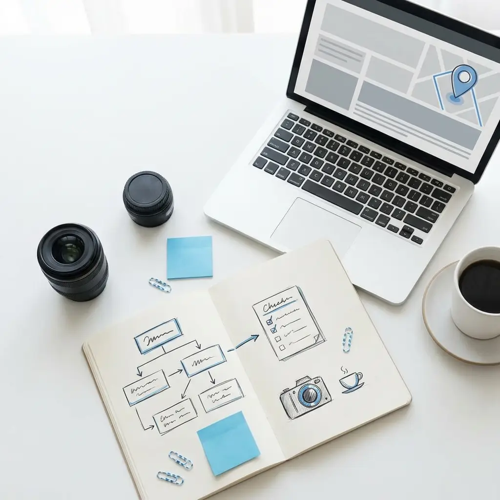
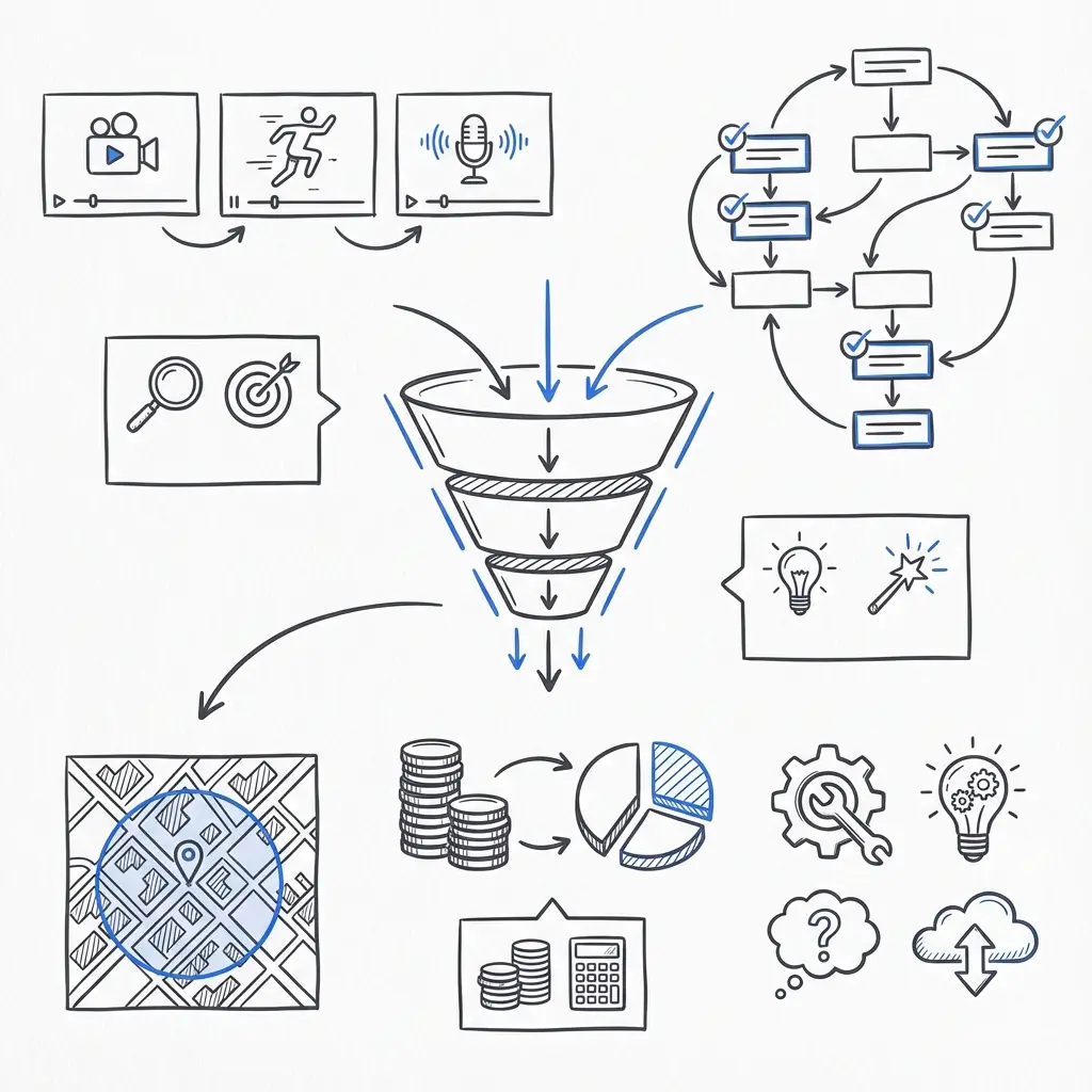
Step 3 — Design: build a flexible, digital-first system
Design for use, not just for looks. A small business wins the most by focusing on a single primary asset – usually a logo plus a colour palette – and making sure those elements work everywhere they will appear. For further reading on building a brand for small businesses see Creating a Brand for Small Businesses: A 2025 Guide.
Key checklist for practical design work:
- Logo — make one that scales: vector version, single-colour version, and a compact mark for tiny spaces.
- Colour palette — pick 3–5 colours with accessible contrast and hex codes.
- Typography — choose one primary font and one fallback for web; prioritise legibility on small screens.
- Templates — create social post templates, an email header, and a simple website hero template.
- Image direction — a clear photography style (natural, minimal, product-focused) with a few sample crops.
When you prioritise those items, you create usable assets that get more mileage than a huge brand system nobody implements.
Design tips for smaller teams
Test your logo at the smallest size it will appear. If it blurs or loses meaning at 40–60px, simplify. Choose colours for contrast first; beauty comes second. Keep typography sizes large for mobile reading. Build templates in systems you already use (Canva, Figma, or your CMS) so people can edit without designers for small changes.
Digital-first: what that really means
Between 2023 and 2025, best practice swung decisively toward responsive, accessible systems. Digital-first means:
- Preparing web fonts or system fallbacks and a stylesheet with hex codes.
- Providing logo files in SVG and PNG at common sizes.
- Designing image crops that scale down to mobile without losing context.
- Ensuring colour contrast meets accessibility thresholds.
This digital-first approach keeps your brand consistent across devices and reduces rework later.
Step 4 — Deploy fast and consistently
Speed beats perfection in the early months. Use a rollout checklist and push the core elements live across the most visible touchpoints:
- Website masthead and homepage descriptor
- Key social profiles (profile image, bio line, cover images)
- Email signatures and newsletter header
- In-store signage or receipts, when relevant
Keep your primary tagline and a one-line descriptor consistent so people quickly remember who you are.
Quick rollout checklist
Do these in the first weekend after you have the assets:
- Swap the website masthead and site favicon.
- Update social profiles and pinned post.
- Replace email signatures for all team members.
- Publish a short announcement post and a newsletter explaining the change.
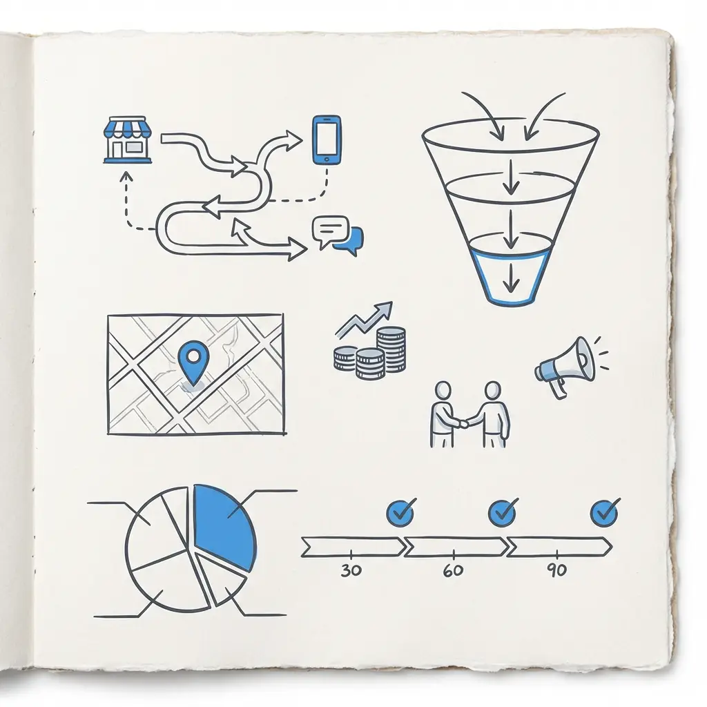
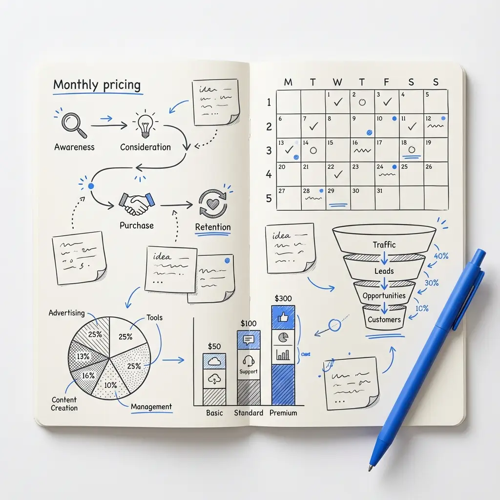
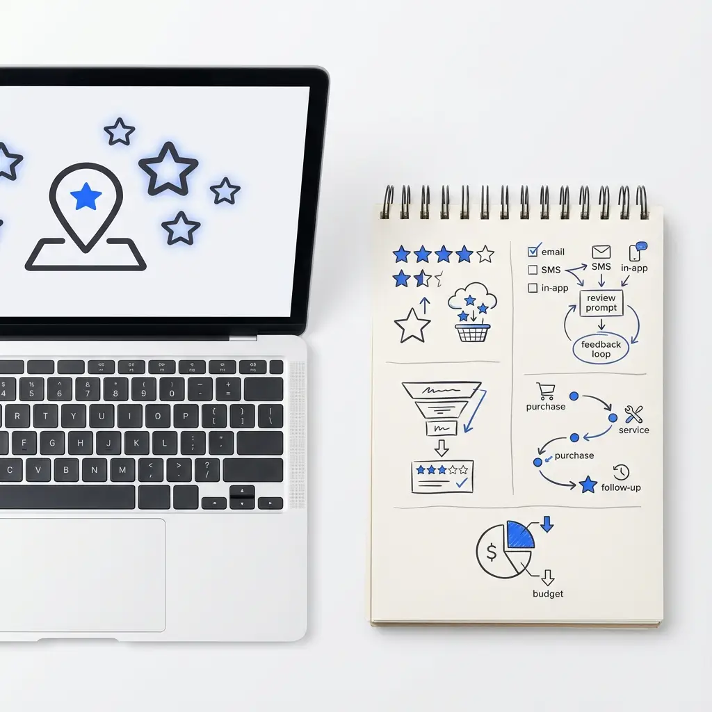
Step 5 — Maintain, measure and iterate
Brand work is ongoing. Track a small set of metrics that connect identity work to business outcomes. Pick a minimal KPI set for the first year and review quarterly. The goal is to learn, not to produce endless reports.
Recommended starter KPIs:
- Awareness: search volume for your brand name and direct visits.
- Engagement: social interactions and time on key messaging pages.
- Business outcomes: lead quality, conversion rates, and repeat purchases for product brands.
Use these signals to test changes: tweak a headline, swap one colour in social templates, or try a different photo style. Small adjustments compound.
Measuring the right way
Compare before-and-after windows around the launch: three weeks before vs three weeks after. Look for direction, not perfection. If searches for your brand name increase, or if pages that use your new messaging get longer time-on-page, you’re moving in the right direction. For lead-driven businesses, measure the quality of leads rather than raw volume.
Governance without red tape
Small teams need rules that enable speed. A one-page brand usage guide works better than fifty pages of rules no one reads. Include:
- The brand purpose sentence
- Positioning paragraph
- Primary logo and clear “do” and “don’t” notes
- Primary colours with hex codes
- Basic voice guidance and a contact for questions
Schedule quarterly brand reviews to keep the guide alive and make small updates instead of big overhauls.
Common trade-offs and how to pick
Two common trade-offs matter most: depth versus speed, and bespoke versus template. For most small businesses, the pragmatic choice is a hybrid:
- Commission a bespoke logo and a tailored palette for uniqueness.
- Use templates for social, email and ad formats to move fast and keep costs down.
This mix preserves distinctiveness where it matters and accelerates execution everywhere else.
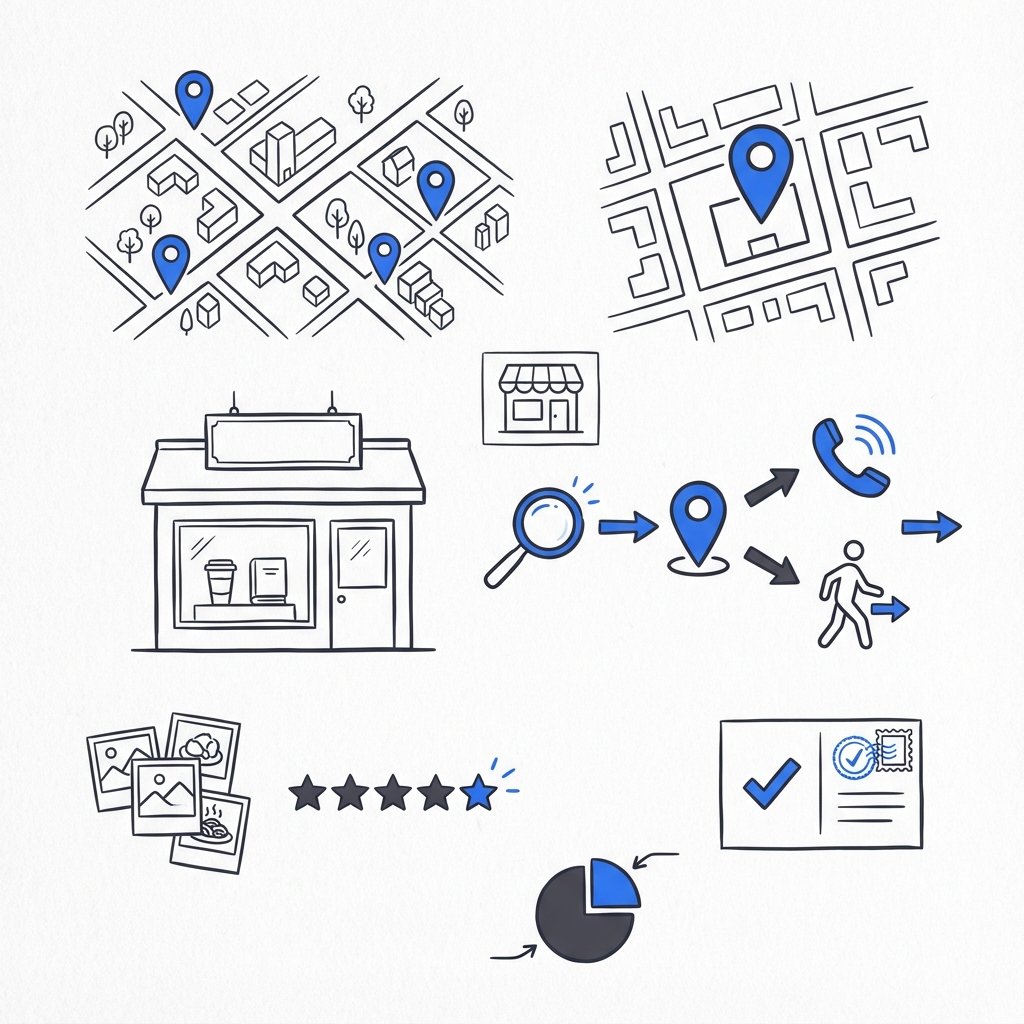
Real-world case: the neighbourhood bakery
Two founders wanted a modern neighbourhood bakery with a tight budget and seasonal launch timeline. Their approach shows the method in action:
- Purpose sentence: “To make simple, honest bread that tastes like home.”
- Audience: busy locals who value dependable quality.
- Positioning: small-batch bakery that uses familiar flavours in dependable ways.
- Visual move: hand-drawn wordmark and warm muted palette; templates for social and a basic site theme.
They rolled out across a weekend and measured foot traffic and email signups. After a few months they swapped in new photography for seasonal products and updated a headline. The early focus on a single primary visual asset and a clear positioning let them open quickly and iterate without confusing customers.
Practical, copyable items you can use now
Below are bite-sized tools you can copy into a brief or a shared doc.
One-line purpose template
“We exist to [what you do] so [who] can [benefit].”
Positioning paragraph template
“For [audience], [brand] is the [category] that [key benefit] because [reason to believe].”
Tone markers (pick 3–5)
Warm, direct, practical, candid, confident.
Starter launch checklist (copyable)
Website masthead; social profile updates; email signatures; pinned social announcement; newsletter; update digital ads.
Testing ideas that are quick wins
Try one small experiment each quarter and measure the result. Examples:
- Swap a homepage headline and measure time on page.
- Change a social template colour and compare engagement rates.
- Run a short ad with new messaging and compare click-through and lead quality.
Make one change, measure for 4–6 weeks, and decide to keep or revert.
Accessibility and responsiveness: build them in
Make accessibility a design constraint from the beginning. That means checking colour contrast, using readable font sizes, and creating clear content hierarchies so screen readers and mobile users can engage. These choices reduce later rework and expand your audience.
Common mistakes to avoid
The fastest ways to slow down brand momentum:
- Trying to say everything at once – focus on one core idea.
- Delaying launch for perfection – speed and consistency win early.
- Skipping measurement – without metrics you guess instead of learn.
- Recreating everything for each campaign – use templates to keep things consistent and fast.
Mini case: a service firm choosing KPIs
A small consultancy discovered that leads from their new site were higher quality even though raw traffic dipped slightly. For their model, lead quality and conversion rate were more predictive of revenue than awareness. That insight reshaped their quarterly tests and content strategy.
How to document a one-page brand guide
Put these headings on a single document or slide:
- Purpose sentence
- Positioning paragraph
- Audience profile (short)
- Tone markers
- Logo and primary colour swatches with hex codes
- Quick “how to use” examples and a rollout checklist
Keep the guide editable and schedule a 30-minute quarterly check-in to update one small item.
Sample language for your homepage descriptor
Use your one-line purpose and a short benefit clause. Example: “Handmade pastries for busy mornings – simple ingredients, honest flavors.” Short, clear and testable.
Small budget strategies
If budget is tight, prioritise the positioning sentence and one primary visual asset. Use free or low-cost tools (Canva, Figma templates, basic theme builders) to create templates. Consider hiring a specialist for a short engagement to produce the bespoke logo and palette – that investment buys recognisability and saves costly redesigns later.
Managing ongoing brand maintenance
Assign a single owner for brand questions and a small design retainer for updates to templates. Bake a lightweight governance model into weekly or monthly roles: who approves campaign changes, who updates templates, and where to ask quick questions.
How Agency Visible typically helps
For teams without in-house design capacity, a short engagement that produces a positioning paragraph, a primary logo, a starter palette and a set of templates is often the highest-leverage investment. The agency focuses on speed, utility and measurable outcomes rather than purely aesthetic deliverables.
Practical FAQ you can use to answer common founder questions
How long does a useful identity take? For a lean approach you can move from discovery to launch in six to eight weeks if you focus on the basics: positioning, logo, colour and templates. How much should a small business invest? Budgets vary, but prioritising a strong positioning statement and a single primary visual asset yields the highest short-term return. Will a simple identity limit future growth? Not if you design modularly – build flexibility so you can add layers later without redoing the core.
Mini workshop: a 4-hour branding sprint
If you only have a half-day, run this sprint with your co-founder or team:
- 30 min: discovery review – collect 5 customer quotes and 3 analytics facts.
- 60 min: write a purpose sentence and a positioning draft.
- 60 min: pick a wordlist for tone markers and choose 3 colours with hex codes.
- 30 min: sketch logo ideas and choose one direction to refine.
- 30 min: list the three templates you need most and assign owners to build them.
This sprint gives you a usable brief and enough assets to start a rollout in two weekends.
Write one clear sentence that answers why your business exists beyond making money, and apply it to three places this week: your homepage headline, one social caption, and your newsletter subject line.
Real metrics to watch and how to read them
Look at direction and quality more than absolute numbers. Rising searches for your brand name, higher time on new messaging pages, and improved lead conversion are strong signals a new identity is working. For product brands, track repeat purchase rate and average order value. Use short windows (3–6 weeks) around changes to draw conclusions, then run another small test.
Templates that save time
Create templates for the most common tasks: newsletter header, social card, event flyer. Put them in a shared folder and make a one-sentence rule: “Use these templates for all public posts unless a campaign needs a bespoke design.” That rule keeps consistency high and reduces approval friction.
Last practical tips
Keep a short list of phrases customers actually use and test them in headlines. Choose colours for contrast first. Simplify logos for the smallest sizes. Set a quarterly calendar to review one small change. These habits compound over time.
Closing thought
brand identity design is a practice, not a one-time project. Start with purpose and audience, hold a clear positioning sentence, design the smallest system that does the job today, and track simple metrics to learn. Move quickly where it matters, and slow down to refine what truly affects customer behaviour. Those habits let a small business create a distinct brand identity without becoming a hostage to perfection.
For a lean approach, you can go from discovery to launch in roughly six to eight weeks when you prioritise the essentials — a positioning sentence, a primary logo, a starter palette and a small set of templates. The timeline shortens if you run a focused sprint and use templates for non-core assets.
Prioritise the positioning sentence and one primary visual asset (a logo plus a palette). Use low-cost tools and templates for social and email. Consider a short specialist engagement for the bespoke logo and palette so you keep uniqueness where it matters and use templates elsewhere to move fast.
Yes — Agency Visible offers short, practical engagements that produce a positioning paragraph, a primary logo, a starter palette and editable templates. Their focus is speed and measurable utility, making them a good fit for small teams that need to become visible without long timelines.
References
- https://www.printful.com/blog/small-business-branding
- https://agencyvisible.com/contact/
- https://www.manifest.ly/blog/create-a-strong-brand-identity-for-your-business-in-2025/
- https://ibrand.media/creating-a-brand-for-small-businesses-2025-guide/
- https://agencyvisible.com/
- https://agencyvisible.com/projects/