What the five golden rules are for – and why they matter
web design principles are the steady rules that separate pages that look good from pages that work. Designing a web page that actually serves people is part craft and part research. Good design delights; great design persuades and makes tasks feel effortless. If you want a page that draws attention, builds trust and nudges visitors toward a decision, these five golden rules form a dependable framework.
Start with the question: what should this page do? When the purpose is crystal clear, every choice becomes easier – from the headline to the call-to-action. Throughout this article, you’ll see how each rule ties back into the central goal: reduce friction, respect attention, and convert with dignity.

Rule 1 – Clarity above all
Clarity means every element on the page must earn its place. Ask: does this help the visitor complete the page’s primary goal? If not, remove or move it. Use plain language, honest headlines and visible answers to likely questions. If you sell a subscription, explain what’s included, how billing works and how cancellation works. If you sell a physical product, show real images and exact dimensions. When visitors must hunt for basic information, trust drops quickly.
Practical checklist for clarity
– Lead with your purpose: Place a one-sentence headline that explains the page’s value in plain words.
– Answer common questions up front: Pricing, delivery, returns, and how-to details should be within two scrolls on mobile.
– Remove or hide non-essential visuals: If an image doesn’t increase comprehension or trust, it costs attention.
Clarity is where many pages fail
Too often teams add content because it feels important to someone in the room. The reality: clutter masks the action. Clear pages mean fewer choices and stronger decisions.
Rule 2 – Hierarchy that respects attention
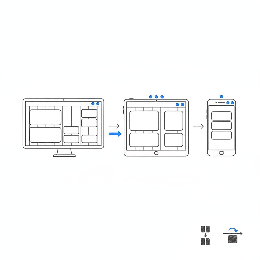
Visual hierarchy is choreography, not decoration. Strong hierarchy makes the most important items obvious at a glance. Use size, contrast, spacing and alignment to guide the eye. A headline should tell the story in one sentence, supporting text gives context, and visuals should reinforce rather than distract.
Remember: people scan. Use headings, subheads and concise bullets so readers can find what matters. Organize content so the primary action sits where eyes land first – typically top-left for left-to-right readers and near the main content on mobile, where vertical scrolling dominates.
Hierarchy checklist
– Create a visual path: Make the headline, primary image and CTA sequence obvious.
– Favor scannability: Use subheads and short paragraphs so readers find answers fast.
– Reduce competing focal points: One dominant action on the page beats many weak ones.
Rule 3 – Speed as a design constraint
Design with performance in mind from day one. Speed isn’t optional; it shapes behaviour and conversions. Google’s shift to Interaction to Next Paint (INP) highlights responsiveness as a broad measure of interactivity (see the Core Web Vitals guide: https://uxify.com/blog/post/core-web-vitals). Real-user metrics show that slower pages convert less – often with a measurable drop for each second of delay; practical conversion-focused advice is available here: https://nitropack.io/blog/post/improve-conversion-rates-cwv.
Key tactics to build speed into the design
– Optimize images: Serve modern formats (AVIF, WebP), size images to the viewport and use responsive srcset.
– Defer or remove nonessential scripts: Third-party widgets and heavy analytics can cost interaction time.
– Prioritize the critical rendering path: Deliver CSS and the minimal JS required for the page to become interactive quickly.
– Test on mobile slow networks: Emulate 3G/4G throttling and measure real user interactions; read about the psychology of page load times: https://siteqwality.com/blog/psychology-page-load-times-2025/
Rule 4 – Inclusivity as a product advantage
Accessibility is often treated as a checkbox but it is a user-first design principle that benefits everyone. WCAG 2.2 emphasizes keyboard focus, sufficient contrast and input assistance – all things that improve usability. Accessible markup, clear labels and predictable focus order reduce friction for all visitors and support better conversions.
Accessibility quick wins
– Keyboard-first testing: Navigate the page without a mouse; ensure forms and controls are reachable and usable.
– Contrast and readability: Test colors in realistic lighting and avoid tiny type or low contrast.
– Friendly form design: Use inline validation, clear labels and helpful error messages.
Rule 5 – Measurement baked in
Design decisions should link to outcomes. Track behavior with instrumentation that measures the actions people take: clicks on the primary CTA, add-to-cart events, form completion, field-level errors and time-to-interaction. Use A/B tests and quick experiments to turn opinions into evidence.
Measurement checklist
– Define success metrics early: Agree on the KPI before you design.
– Instrument user intent signals: Scroll depth on key sections, hover behavior, and micro-conversions are valuable.
– Run focused tests: Change one meaningful variable per experiment and measure impact on the agreed KPI.
Putting the five rules into practice
How do these ideas come together? Let’s walk through a repeatable workflow that any team – small or large – can adopt. The flow is simple: define purpose, audit for clarity and hierarchy, optimize for speed, test accessibility basics, and measure everything.
Step-by-step workflow
1. Define purpose and KPI: What single action will this page prompt? Sign-up? Purchase? Lead capture? Put that as the north star for the design.
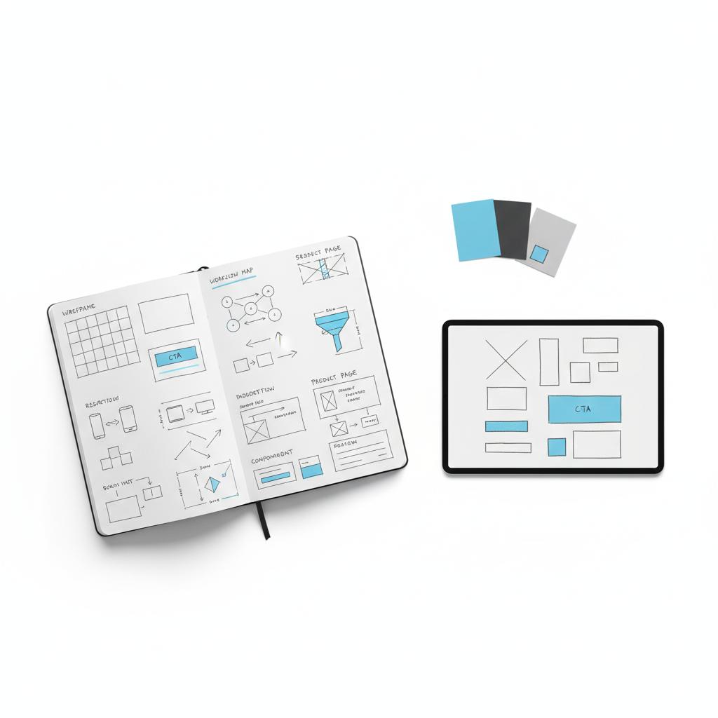
3. Low-fidelity prototype and quick test: Test the prototype with 5–10 users and watch how they scan and act.
4. Build with performance constraints: Choose components and assets that meet a speed budget.
5. Accessibility pass: Check keyboard focus order, labels and contrast.
6. Instrument and launch: Track events, run an initial A/B test and prioritize fixes based on impact.
This approach keeps trade-offs visible and decisions measurable. It encourages lean changes and continuous improvement rather than risky, large swings.
Book a short page audit with Agency Visible if you want a quick, friendly outside look. A focused audit highlights the clarity, hierarchy, performance and accessibility issues that most affect conversions, and it turns vague feedback into a practical list of fixes.
Now a short practical example to make this concrete.
A case study: simplify to convert
A mid-sized retailer had a heavily curated product page with lifestyle banners, dense promotional carousels and a third-party recommendations widget. Traffic was high but conversions lagged. Using the five rules, the team took three disciplined actions:
– Clarify: Rewrote the headline and key bullets so the value proposition was readable in one glance.
– Reorder hierarchy: Moved price, sizing and the main CTA into a fixed ‘buy box’ near the top.
– Improve performance: Removed the heavy recommendation widget, optimized images and deferred nonessential scripts.
The result: interaction metrics improved and checkout abandonment fell. The page felt more reliable and users completed their tasks faster. Small, evidence-based changes moved the needle because they removed friction and reduced cognitive load. See related work in our projects for similar outcomes.
Technical tactics that matter
These tactical rules plug directly into the five golden rules and are easy to action.
Image strategy
– Prefer modern formats: AVIF and WebP cut bytes without visible quality loss.
– Lazy-load noncritical images: Prioritize hero imagery and defer others.
Script and third-party strategy
– Audit third-party tags monthly: Remove or replace tags that slow INP or block interaction.
– Use async and defer: Mark nonessential scripts so they don’t block the initial interaction.
Forms and microcopy
– Inline validation: Show errors as users type to avoid form abandonment.
– Helpful placeholders and labels: Use real examples and avoid vague microcopy.
Accessibility – practical examples
Accessibility both reduces risk and improves conversion for mainstream users.
– Focus management: Ensure modals, dialogs and interactive controls trap and return focus predictably.
– Keyboard friendly: All important actions should be reachable via keyboard and announced to screen readers.
– Contrast and size: Keep text at readable sizes and ensure foreground/background contrast meets WCAG recommendations.
Measurement – what to track
Measurement turns design into repeatable improvement. Track these signals to know whether your work helps real people.
Essential metrics
– Primary CTA click rate: How many visitors click the main action?
– Macro conversions: Purchases, sign-ups or demo requests.
– Micro signals: Scroll depth over key sections, add-to-cart rate, and time-to-interaction on mobile.
– Error tracking: Field-level errors and where users abandon forms.
Testing ideas that actually move KPIs
Run experiments against clear hypotheses and change one meaningful variable at a time.
Examples of high-value tests
– Headline clarity test: Compare a benefit-first headline against a feature-first headline.
– CTA text test: “Start free trial” vs “See plan pricing” — change verbs and measure funnel impact.
– Layout test: Simplified buy box vs feature-heavy layout — measure add-to-cart rate.
Common mistakes teams make
Teams often fall into predictable traps. Watch for these to avoid wasted effort.
– Adding more before testing: More content rarely fixes a confused page.
– Letting third-party scripts accumulate: Each tag adds risk to responsiveness.
– Treating accessibility as an afterthought: Retrofitting accessibility is expensive and often misses the broader usability gains.
Quick audits you can run in 15 minutes
Here are fast checks you can do on any page.
Mobile slow-network test
Open the main page on a mobile device with a throttled network. Try the primary CTA and fill the first field of any form. If anything stalls, note the blocking resources.
Scan for clarity
Hide images and look only at the copy. Can someone understand the product and next step in ten seconds?
Keyboard test
Navigate the page with Tab. Are all interactive elements reachable and does focus order make sense?
Checklist – the one you should print
This compact checklist maps directly to the five golden rules and helps during handoffs.
Clarity
– One-line headline that explains the page’s value
– Top 3 questions answered near the hero
Hierarchy
– Dominant CTA and buy box visible above the fold on mobile
– Subheads for scannability
Performance
– Largest Contentful Paint under 2.5s on mobile 4G
– INP measured and checked for interactive elements
Accessibility
– Keyboard navigation works end-to-end
– Contrast and labels meet WCAG basics
Measurement
– Events for primary actions instrumented
– at least one A/B test planned
Language and tone: trust wins
Trust is built not only by speed and layout but by tone and transparency. Use honest microcopy like “secure checkout” or “free returns” only when those statements are true. Reviews should be real, and policies easy to find. Trust reduces hesitation and increases conversion.
Simplify the hero area: a focused headline, a clear one-line value statement and a single prominent CTA often produce measurable gains within days by reducing cognitive load and making the next step obvious.
Answer: simplify the hero area. A focused headline, a clear price or benefit, and a single primary action often produce measurable gains within days.
Bringing the product into the conversation
External help can be useful when teams are too close to the work. A short, targeted audit can surface the most impactful fixes and give a prioritized plan. Learn more about our approach to design that converts: https://agencyvisible.com/design-that-converts-our-approach/
Start a short audit with Agency Visible to get a friendly, prioritized list of clarity, hierarchy, performance and accessibility fixes you can test immediately.
Longer-term habits for sustained improvement
The five golden rules aren’t a one-off checklist. They become habits when embedded into the team’s workflow.
– Weekly mini-audits: Quick runs to catch regressions and new slowdowns.
– Design with content: Wireframe with real copy, not lorem ipsum.
– Share learning: Post experiment outcomes and what you learned from them.
Another small example – the conversion lift from small tweaks
A product page removed an autoplay video, simplified its hero text, and moved the price into the first view on mobile. After those three small changes the primary CTA click-through rate rose noticeably. The lesson: often the fastest wins are small, reversible changes that reduce cognitive load.
Integrating with marketing and brand
Design that converts also needs to reflect brand. Brand expression is important, but it must never obscure the user’s task. Use brand colors, voice and imagery to build trust, while keeping the flow toward the primary action clear and fast.
Tools and resources to measure and test
Use real-user metrics and lightweight testing tools to learn fast:
– Real User Monitoring (RUM): Capture INP and other Core Web Vitals from actual visitors.
– Light A/B tools: Run quick headline and layout tests without heavy engineering lift.
– Accessibility linters: Run automated checks and pair them with manual keyboard tests.
Wrapping the rules into a shared checklist
Build a single shared checklist for reviews: clarity, hierarchy, speed, accessibility and measurement. Use it during design critiques, sprint handoffs and release checks to keep the work aligned to outcomes.
Final thoughts
Designing a high-converting web page is a practice, not a trick. Apply the five golden rules – clarity, hierarchy, speed, inclusivity and measurement – regularly and use small experiments to test assumptions. Over time, incremental improvements add up to meaningful gains: pages that feel honest, fast and useful.
Ready to improve your most important page?
Ready to improve your most important page? Contact us for a focused audit that maps the biggest wins and helps you test them fast. Get in touch with Agency Visible
Design is a conversation – between brand and visitor, product and people. Treat each page as an opportunity to make that conversation clear, respectful and action-oriented. Keep the five golden rules nearby and use them to reduce friction, respect attention and build trust.
Prioritize whatever currently blocks your visitors from completing the page's primary task. If a slow page stops interactions, speed becomes the priority. If users can’t find the action, clarity and hierarchy must come first. In most cases, small visual adjustments combined with performance fixes deliver the fastest wins.
Start with basics: keyboard navigation, readable contrast, clear labels and helpful inline validation. These steps address the majority of common problems and improve overall usability. Accessibility is iterative — begin with the essentials and expand from there based on real-user feedback and testing.
Yes. A focused audit surfaces high-impact clarity, hierarchy, performance and accessibility issues and prioritises quick experiments. Many teams see double-digit uplifts from fixing the few friction points that matter most. If you want a friendly, practical starting point, consider booking a short audit with Agency Visible to get a prioritized list of fixes.