Understanding the quiet judgement of the first three seconds
The first three seconds on a page are quiet, but they are not empty. They are thick with judgment, with a tiny crowd of neurons deciding whether this place is worth staying. Designers and product teams call this the 3 second rule web design – the moment when visitors form an initial sense of relevance and clarity. That feels like almost nothing, and yet it is the crossroads where attention either turns into curiosity or slips away.

Why the 3 second rule web design matters
People form aesthetic impressions in a blink – roughly 50 milliseconds – and that first glance sets expectations. But there’s a technical twin to that psychological snap: the speed at which the page’s main content appears. Google’s Core Web Vitals (notably Largest Contentful Paint) give us a practical yardstick. Aim for LCP under 2.5 seconds to be comfortably inside the first few seconds a visitor judges your site.
When you combine psychology and performance, the rule becomes actionable. The 3 second rule web design is not just an aesthetic idea; it’s a measure of clarity, speed, and immediate usefulness.
What visitors are looking for in those early moments
When a user lands, they’re not asking for a full argument. They want a quick answer to two simple questions: what is this? and why should I care? A readable headline, a short supporting line, and one clear call to action are the trio that answers those questions best. If that trio is missing or muddled, you’ve already reduced your chances of keeping the visitor.
Clear above‑the‑fold messaging and a fast render are the heart of the 3 second rule web design. The message tells the brain that the page is relevant; the speed makes that message believable.
Real improvements that came from simple choices
Here’s a short case: a niche e‑commerce homepage had a dense hero, an oversized background image, and fonts that loaded late. Bounce rate for paid traffic hovered in the low 60s. We simplified the hero to a single value statement, reduced image size and lazy‑loaded the rest, inlined the critical CSS for above‑the‑fold, and deferred non‑essential scripts. LCP dropped from 3.8s to 1.9s. Bounce rate fell into the mid‑40s and conversions rose by a clear single‑digit percentage. That is the practical payoff of respecting the 3 second rule web design.
To dig into practical audits and examples, see our work on the projects page or start at the Agency VISIBLE homepage.
Key metrics to watch
To know whether your first moments are working, track a mix of performance and behavior metrics. Core Web Vitals are essential – especially LCP and First Input Delay – but pairing them with behavioral indicators gives context:
- Bounce rate and time on page show if visitors immediately leave or linger.
- Scroll depth reveals whether users move past the fold.
- CTA click rate measures whether the above‑the‑fold message drove action.
- Heatmaps and session replays give qualitative evidence of how users scan and where they get stuck.
And the most reliable path from guesswork to knowledge is testing: run A/B experiments and let results guide the design.
Fast technical levers that usually deliver wins
There are practical, high‑impact technical moves you can make quickly:
1) Optimize the hero
Keep the above‑the‑fold content focused. A concise headline, a single supporting line, and one clear CTA are your best friends. Think of the hero as a firm, friendly handshake – not a buffet of choices.
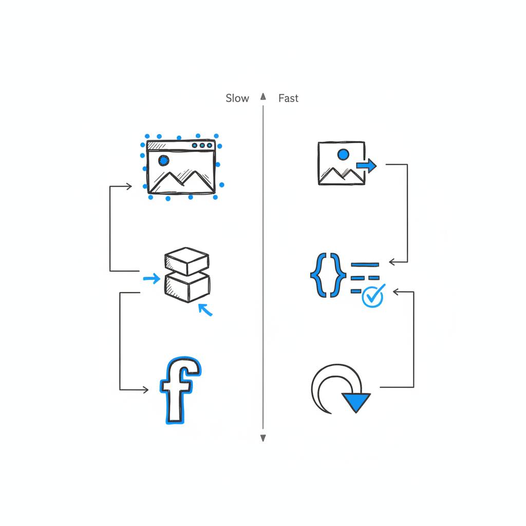
2) Image handling
Compress images, serve modern formats like WebP or AVIF where supported, and resize them for the viewport. Use lazy‑loading for below‑the‑fold content. If the hero is an image, prioritize it so LCP improves. A small logo in the corner can reinforce brand recognition without slowing the page.
3) Fonts and critical CSS
Font loading can delay visible text. Use font strategies like font-display: swap, preload critical fonts, or use system fonts as fallbacks. Inline the small slice of CSS needed to render the hero (critical CSS) and defer the full stylesheet so the browser can paint faster.
4) Trim and defer JavaScript
Move non‑essential scripts to after the initial render, remove unused libraries, and defer third‑party widgets until after the main content is visible. Often these scripts are the sneaky blockers of a quick first paint.
5) Server and CDN improvements
Faster origins, sensible caching, and a good CDN reduce latency and shave milliseconds off LCP. These infrastructure improvements compound with front‑end work.
Design choices that support the first three seconds
Speed alone isn’t enough. A fast but sloppy page will still fail. Design with intention:
- Use strong contrast and a clean composition so the eye finds the headline quickly.
- Limit choices to one primary action above the fold; too many options dilute the decision.
- On mobile, make the essential information visible without scrolling.
These approaches help you honor the 3 second rule web design across devices.
Testing: the non‑mystical way to improve
Testing is where strategy meets reality. A/B tests and rigorous measurement remove opinion and replace it with evidence. Change one thing at a time – headline, image delivery, font strategy – and run the test long enough to reach confidence. Also segment by device and traffic source: mobile users often decide faster and tolerate less waiting than desktop visitors.
Use heatmaps and session replays to spot small, repeatable problems: a sticky nav overlapping the CTA on a small screen, a cookie banner pushing the hero down, or a font that hides the headline until it’s fully loaded.
Balancing aesthetics and performance
Trade‑offs will arise. Some brands need rich imagery to convey quality; others win on spare clarity. The answer isn’t a dogmatic formula – it’s testing. For example, replacing a heavy hero image with a lightweight version can improve LCP and reduce bounce, but it might also reduce average order value if that image communicated subtle quality cues. In that case the solution is nuanced: show a light hero first and reveal a higher‑resolution gallery just below the fold after engagement.
Measuring results and setting expectations
Commercial impact varies. Industry case studies report single‑digit to double‑digit lifts in conversion when speed and clarity are improved. The exact lift depends on the initial problem size and the traffic channel. A fast site sees small gains from shaving a few hundred milliseconds; a slow site can leap forward with basic fixes.
The practical plan is continuous measurement. Track Core Web Vitals and behavioral KPIs, re‑test when you change creative, and treat improvements as iterative. Websites are living systems; steady, data‑driven adjustments win over one‑off hero projects.
Practical checklist: actions you can take this week
Here is a short, prioritized list to respect the 3 second rule web design today:
- Clarify the above‑the‑fold headline and CTA.
- Compress and resize hero images; use modern formats.
- Inline critical CSS and defer the rest.
- Preload or use sensible font‑display strategies.
- Delay non‑essential JavaScript and audit third‑party scripts.
- Set up LCP and FID monitoring in your analytics.
- Run one focused A/B test to measure impact.
Tools that help diagnose the first moments
Start with Lighthouse and PageSpeed Insights for actionable lab diagnostics. Complement those with real user monitoring (RUM) to see how actual visitors experience speed. Use heatmap tools and session replays for behavioral context. Finally, run A/B tests to validate changes in real traffic.
If you want a practical, human‑centered partner to move quickly, reach out to Agency VISIBLE for a short audit and tactical plan — it’s a friendly way to get focused help without agency complexity.
Common pitfalls and how to avoid them
Here are repeat offenders that slow the first impression and how to fix them:
- Oversized hero images: compress, serve responsive sizes, and use modern formats.
- Blocking webfonts: preload critical fonts and use font‑display rules.
- Third‑party bloat: delay or remove non‑essential scripts.
- Too many CTAs: reduce to one strong primary action above the fold.
How to run focused A/B tests for the three‑second moment
Pick a single hypothesis (for example, “a clearer headline will increase CTA clicks”) and test it against your current control. Run the test for each major channel and device type. Combine quantitative lift with qualitative session replays to understand the ‘why’ behind the numbers.
Case studies and realistic expectations
Many organizations see single‑digit conversion lifts and sharper engagement metrics after respecting the 3 second rule web design. The biggest wins usually come from removing obvious friction: blocking fonts, oversized images, and intrusive third‑party scripts. But sometimes results are subtle: a headline tweak can increase scroll depth without affecting immediate conversion, revealing later opportunities to optimize the funnel.
One cautionary story
A retail client replaced a rich hero with a lighter file and saw improved bounce and conversion rates, but average order value dipped. The image had been doing unseen work: conveying product quality and encouraging higher baskets. The fix was staged: deliver a lightweight hero first, then load a richer product carousel after initial engagement. That preserved speed while recovering average order value.
Practical heuristics for above‑the‑fold content
Lead with a concise headline that names the benefit. Follow with a short sentence or phrase that clarifies who it helps or how. Use one clear primary CTA and keep navigation unobtrusive. On mobile, be ruthless: push essential info to the top and ensure that the headline is visible without scrolling.
Yes, visitors often form a quick, initial judgment within a few seconds based on visual cues and how quickly main content appears. Controlled studies show aesthetic impressions form in milliseconds, and Core Web Vitals like LCP confirm that perceived speed strongly influences early behavior. The 'three seconds' is a useful rule of thumb to prioritize clarity and speed during those initial moments.
These heuristics are starting points to test, not rules to follow without thought.
How to prioritize fixes when resources are limited
When time and budget are constrained, start with surgical changes that address the biggest blockers to LCP and clarity: headline and CTA clarity, image compression and delivery, inline critical CSS, and deferring non‑critical JavaScript. Each of these changes is small, measurable, and often inexpensive.
Tracking cadence and continuous improvement
Track Core Web Vitals and behavioral KPIs continuously. Re‑test after major creative updates, and keep a running list of experiments. Small, steady wins compound – the site that improves a few percent every month will outperform a site waiting for a big rewrite.
Summary: the practical heart of the 3 second rule
The 3 second rule web design is a compact idea with wide consequences. It asks two simple things: present a clear, relevant message above the fold, and make sure it renders quickly. Do those two things and you will reduce bounce, lift engagement, and create better chances of conversion. Combine careful measurement, focused testing, and sensible technical fixes to make the first three seconds the most productive part of a visit.
Frequently asked questions
How strictly should I target LCP ≤ 2.5 seconds?
LCP ≤ 2.5 seconds is a useful, evidence‑based goal. If you’re already below it, you’re in a good place. If you’re above it, prioritize the largest visible element for improvement and measure the impact on bounce and conversions.
Does the 3 second rule web design apply equally to mobile and desktop?
Mobile users typically decide faster and tolerate less waiting, so test separately and consider simpler mobile layouts. A hero that works on desktop might overwhelm the mobile viewport and push the headline below the fold.
How many changes should I make at once?
Run focused tests when possible. Change the headline, or image delivery, or font strategy – not all three at once. When multiple changes are needed, stage them or run multivariate experiments.
Final note on measurement and mindset
Improving the first impression is ongoing work. Maintain steady measurement of Core Web Vitals and behavioral KPIs, re‑test after creative changes, and focus on incremental, tested improvements. The first three seconds are quiet but powerful – treat them as your best opportunity to invite a visitor in.
Make your first three seconds irresistible
Ready to make your first three seconds count? If you want practical help that moves fast, get a tactical site audit and prioritized plan from a partner who focuses on clarity and growth – reach out to start the conversation.
Thanks for reading – give the first three seconds some attention and you’ll see better visits, clearer engagement, and steadier growth.
LCP ≤ 2.5 seconds is a solid, evidence‑based benchmark. If you’re above it, prioritize the largest visible element — usually the hero image or headline — by compressing images, serving modern formats, inlining critical CSS, and deferring non‑essential scripts. Monitor bounce and conversion as you improve LCP to see real business impact.
Mobile visitors often make decisions faster and tolerate less waiting, so you should test mobile and desktop separately. Consider simpler mobile layouts that surface the headline and primary CTA without scrolling, and tune images and fonts specifically for mobile viewports.
Start with surgical changes: clarify the headline and single CTA, compress and resize the hero image (use modern formats), inline critical CSS, and defer non‑essential JavaScript. Run one focused A/B test and measure bounce, time on page, scroll depth, and CTA click rate to confirm impact.